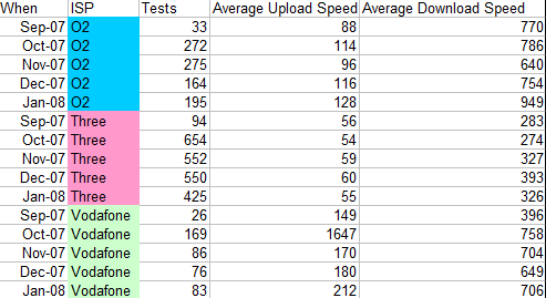
Well we all knew that right? Anyway, Blacknight’s Speed Test have been logging speed tests for a long while now and have given me some raw data for the Mobile Broadband Providers. A complete and longwinded extensive explanation and full raw data is at the end of the post with a quicker summary here.
The gist of it is that speeds on all of these networks are terrible but Three performed the worst in terms of download speed and Quality of Service. Here’s a quick chart showing the results of people who believed they were on a 3mb broadband package, clicking on the image will give a larger table with more details. All speeds are in kb/s (that’s kilobits, not kilobytes; 8kb = 1kB) So really they should be expecting to see 3000 in download but many only get 300.

Full explanatory note from Blacknight:
I have to attach a huge caveat to this data. I can’t comfortably say that the speed data has any claim of authority because there’s no way we can currently verify that the people using Irish ISP Test gave the correct speed for the plan they’re on. The data on Quality of Service, on the other hand, has a much better case for being authoritative, and in real terms, it’s the information you’re really interested in.
First, I have to make sure you’re able to interpret the data correctly. Three files are attached.
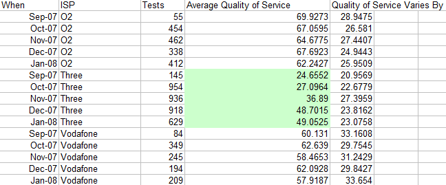
“qos.csv” reports the Quality of Service the mobile ISPs are giving per month.

Quality of Service (QoS) is a measurement of how reliable the connection is and varies between 0% and 100%, the former being no service and the latter being perfect service. If a service provider is providing a good service, they should be hitting an average QoS of around 90% or more. As you can see, O2 give the best QoS, giving roughly 65% QoS on average. Vodafone follow closely behind, with Three trailing quite badly, though the trend is that they’re catching up, with their competitors as the QoS their customers are getting has risen consistently since September where it was below 25%, to close to 50% now.
Quality of Service can be thought of as a measurement of how close they’re hitting the speeds they advertise. A high QoS means that they’re approaching their advertised speeds, whereas one around 50%-60% compared to the kind of intermittent reception you get on your phone when you’re going through a tunnel. By way of example, we have an 8Mb/s line in our office. I just did a test on it and managed to get just over 6Mb/s out of it and the QoS reported was 85%, which means we’re getting close to the speed we ought to be getting at 100% QoS, and it matches the speed we’re getting pretty closely.
The second and third files, “stats-by-isp-speed.csv” and “stats-by-isp-speed-month.csv” break this down by ISP and speed, and again
by month. This data isn’t really as interesting or accurate, but here’s an explanation of what it means.
The ‘Speed Given’ column reports the speed in kb/s (that’s kilobits, not kilobytes; 8kb = 1kB) that the user reported. For instance, 56 is the same as an old 56k dial-up modem, 128 is roughly the same as an ISDN line, 1024 is roughly the same as a 1Meg DSL line, and so on. ‘Download Speed’ refers to how fast a data (such as a file, page of a website, image, video, &c.) can be downloaded and is, again, given in kb/s. ‘Upload Speed’ refers to how quickly something can be sent from your computer over your connection to somewhere else, such as sending an email, submitting a form on a website, putting a photo on Flickr, and so on. This number will always be less than the download one as people tend to download more than they upload and ISPs use this heuristic to share the connection in a way that’ll give the best experience for the customer. The when an ISP advertises a connection speed, they’re usually talking about the download speed.
You’ll notice that the upload and download columns come in pairs. The first one give the average speed the speed test got, and the second gives how much this speed varies between tests (the standard deviation). An average by itself is meaningless because it tells you nothing about how spread out thenumbers that were averaged out were, or if they cluster around the average. If you have a standard deviation that’s close to zero, then the numbers averaged are all close to the average, but the closer the standard deviation is totwice the average, the closer the data is to being completely chaotic.
So lets say that two ISPs provide a 1M data package, and all both their users manage to get an average of 500k and 650k. Now, lets say that the standard deviation for ISP-A’s customers from the average speed is about 50, but the standard deviation for ISP-B’s customer’s is 400. You’d want to go with ISP-A because even though you’re not getting a slower speed, you’re getting it far more consistently than ISP-B, where it’s pretty much pot luck whether you’ll get full speed or a trickle.
Again, the QoS columns are what you really want to be concentrating on in these datasets.


